
Kindwork
Kindwork
Kindwork
Where good people help good people
Where good people help good people
Where good people help good people

Timeline:
Timeline:
September 2025 - December 2025
Role:
Role:
UX Research & Design
Tools:
Tools:
Adobe Illustrator, Adobe InDesign, Adobe Photoshop, Figma
Adobe Illustrator, Adobe InDesign, Adobe Photoshop, Figma
Kindwork is a mobile and web platform built to solve a real mismatch in the nonprofit world: skilled designers frequently want to donate their talent to causes they care about, and nonprofits desperately need high-quality creative work but can rarely afford it. Kindwork closes that gap by matching professional designers directly with vetted nonprofit organizations for pro bono projects - complete with scheduling, hour-tracking, and portfolio-ready case studies built in.
The brand identity, "Where good people help good people," leans into a tone that's playful but credible: clean and modern like the best design tools, but warm and human enough to feel like an independent design studio with a social mission, and avoids being another cold tech startup.
Simulated Problem: Kindwork is a new company, and they need to get their name out there to attract talented professionals who are looking to do meaningful pro bono work. Kindwork has hurdles to get over to attract the right people. Pro bono work is seen as unpaid, disorganized, low-prestige, and easy to deprioritize against paid client work. Kindwork needs to reach new designers where they already spend their time: their inbox, industry print publications, and Instagram.
September 2025 - December 2025
Design and launch a three-channel acquisition campaign (email series, full-page magazine ad, Instagram content) that:
Speaks to three distinct designer motivations
Reframes pro bono work around professional benefit: visibility, portfolio value, "Equity Design" as a credential, not just goodwill
Establishes a consistent visual and verbal identity across every touchpoint: Droog for bold, bubble-like titles; Sofia Pro for clean, human-feeling body copy; a color and icon system built around connection, exchange, and community
Drives a measurable action per channel (app downloads, sign-ups, or landing page visits)
Goal
About
About
Kindwork is a mobile and web platform built to solve a real mismatch in the nonprofit world: skilled designers frequently want to donate their talent to causes they care about, and nonprofits desperately need high-quality creative work but can rarely afford it. Kindwork closes that gap by matching professional designers directly with vetted nonprofit organizations for pro bono projects - complete with scheduling, hour-tracking, and portfolio-ready case studies built in.
The brand identity, "Where good people help good people," leans into a tone that's playful but credible: clean and modern like the best design tools, but warm and human enough to feel like an independent design studio with a social mission, and avoids being another cold tech startup.
Simulated Problem: Kindwork is a new company, and they need to get their name out there to attract talented professionals who are looking to do meaningful pro bono work. Kindwork has hurdles to get over to attract the right people. Pro bono work is seen as unpaid, disorganized, low-prestige, and easy to deprioritize against paid client work. Kindwork needs to reach new designers where they already spend their time: their inbox, industry print publications, and Instagram.
Design and launch a three-channel acquisition campaign (email series, full-page magazine ad, Instagram content) that:
Speaks to three distinct designer motivations
Reframes pro bono work around professional benefit: visibility, portfolio value, "Equity Design" as a credential, not just goodwill
Establishes a consistent visual and verbal identity across every touchpoint: Droog for bold, bubble-like titles; Sofia Pro for clean, human-feeling body copy; a color and icon system built around connection, exchange, and community
Drives a measurable action per channel (app downloads, sign-ups, or landing page visits)
Timeline:
Role:
Tools:
About
September 2025 - December 2025
UX Research & Design
Goal
Design and launch a three-channel acquisition campaign (email series, full-page magazine ad, Instagram content) that:
Speaks to three distinct designer motivations
Reframes pro bono work around professional benefit: visibility, portfolio value, "Equity Design" as a credential, not just goodwill
Establishes a consistent visual and verbal identity across every touchpoint: Droog for bold, bubble-like titles; Sofia Pro for clean, human-feeling body copy; a color and icon system built around connection, exchange, and community
Drives a measurable action per channel (app downloads, sign-ups, or landing page visits)
Adobe Illustrator, Adobe InDesign, Adobe Photoshop, Figma
Research & Discovery
Research & Discovery
Brand Design
Research & Discovery
Brand Design
Brand Design


Persona & Ideation:
Persona & Ideation:
I anchored each channel to a specific persona so the messaging never had to speak to "designers" in the abstract:
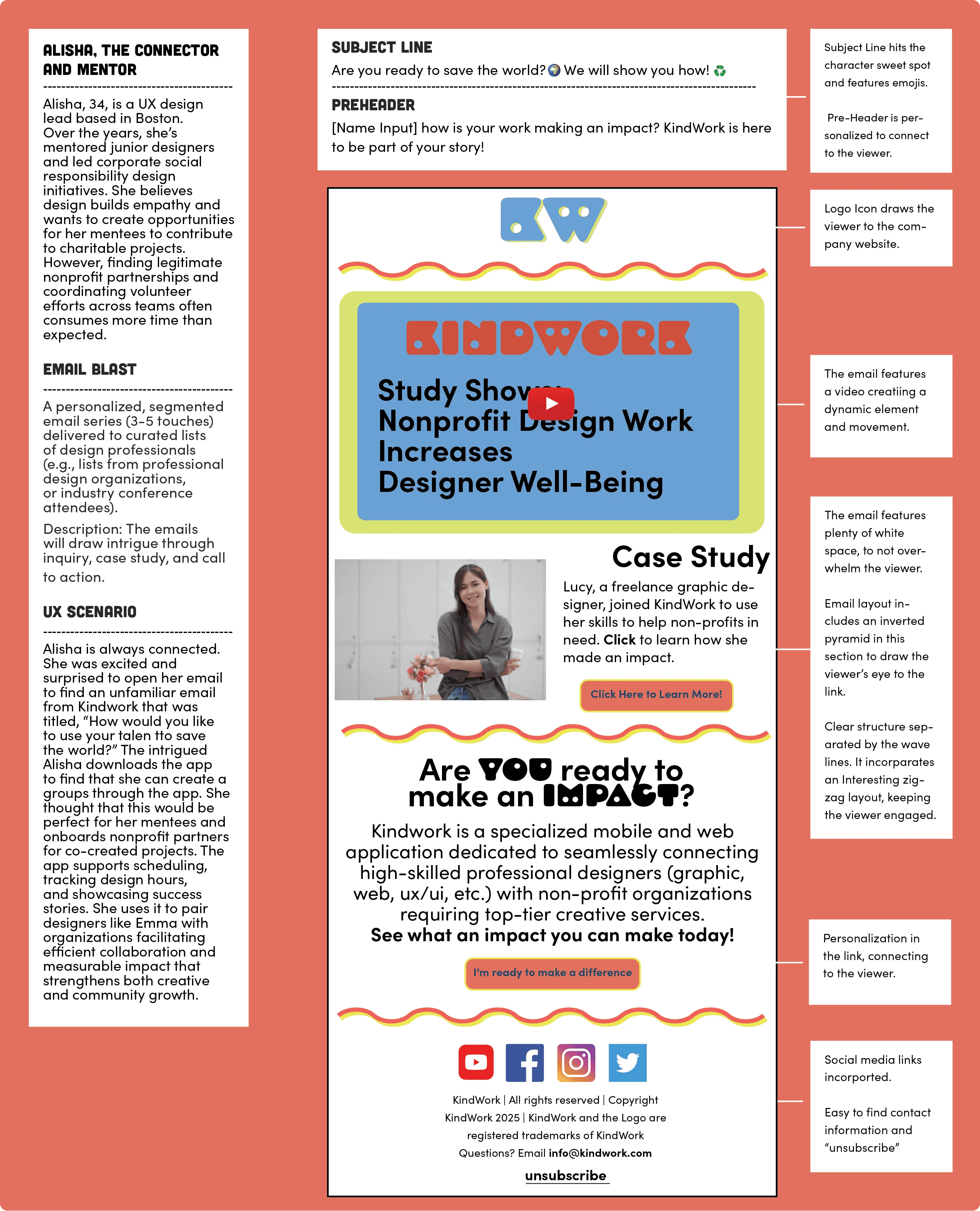
Alisha, the Connector and Mentor (email) is a UX lead who wants structured ways to route her mentees toward legitimate nonprofit work. The email used an inverted-pyramid layout with wave-line dividers for a zig-zag scan pattern, built after sketching from reference layouts (Converse, an NFL team newsletter).
Aaron, the Purpose-Seeking Professional (magazine print) is an agency designer who's financially stable but creatively burned out, craving meaning. The magazine ad leaned on a bold, minimal, mostly-white-space composition designed to pop against dense editorial pages, paired with a QR code for trackable landing-page visits.
Emma, the Changemaker (Instagram) is a freelancer already volunteering informally, looking for a real bridge into consistent purpose-driven work. The Instagram plan used a three-column content grid, proof-of-quality design work, designer/nonprofit stories, and impact metrics, so the feed itself told a complete story before anyone tapped a single post.
Persona & Ideation:


Iteration Testing:
Iteration Testing:
Feedback and testing shaped changes across every deliverable:
The brand kit itself was revised. An early palette (forest teal, honey gold, sage) was built around a "boutique design studio" feel - sophisticated and nature-inspired. It was ultimately replaced with a bolder coral, cornflower blue, and lime-green system paired with the chunky Droog wordmark, which read as more energetic and matched the "get ready to do some good" tone the team wanted over a quieter, more muted studio aesthetic.
Email subject lines went through several rounds. I drafted five candidate lines, from a listicle hook ("3 Ways to Use Your Creative Talent for Good") to a direct challenge ("Stop Volunteering. Start Designing for Equity."), before landing on a single curiosity-driven line with an emoji and a personalized preheader. The final build also added a data-forward "Impact Report" section (time saved, money saved, top industries served) that wasn't in the original sketch, so the email actually delivered on the "we'll show you how" promise in the subject line.
The print concept was simplified. Early direction explored a surreal "paper cutout" style, unrelated objects combined for a jarring, editorial feel (a vintage camera for a head, a flamingo on a tripod). That direction was ultimately dropped in favor of a warmer, more relatable "torn paper" head-swap portrait of a real person, better matching Kindwork's human-centered brand voice rather than a purely conceptual, object-driven one.
Copy was tightened using core writing principles: concrete over abstract, strong verbs, cutting filler, which is why the final print headline reads as a direct, active line ("Find meaning in your work again.") rather than the more descriptive draft copy used earlier in the process.
Iteration Testing:
Evaluation:
Evaluation:
The campaign succeeds at giving Kindwork a voice that's consistent without being repetitive. The same iconography (connection circles, exchange arrows), type pairing, and "good people help good people" spirit shows up in an inbox, a magazine, and a phone feed, but each one is utilized with a specific person in mind reading it.
Future Testing & Iterations:
A/B test the subject lines for real, rather than shipping the single strongest-on-paper option. Five real candidates were written, only one was ever tested against actual open-rate data.
Reconcile the brand kit history. Two different color systems exist across the project's documentation (the early teal/gold kit and the final coral/lime kit). Before this scales into more channels, it needs one locked, documented brand guideline so future assets don't drift.
Build the two-sided story. All three personas are designers, but Kindwork is a two-sided marketplace, and nonprofits are half the equation. A companion campaign speaking to nonprofit sign-ups (not just designer acquisition) is the next phase.
Prototype the video concept that got cut. An early Instagram plan proposed a short-form "journey" video series ("I want to help but don't know how" to a successful nonprofit partnership). It never made it into the final project and could be a strong test for deepening engagement.
Add an accessibility pass. None of the current materials document contrast checks or alt text for the icon system, but it would be built before wider distribution, especially given the bold coral/lime combinations.