
This project showed us the same problem: most wellness apps assume that the user has bandwidth to spare, and if you're dealing with trauma or cognitive overload, that assumption is exactly backwards. Harmony is our solution. It is a sound-based wellness app that doesn't ask more of you than you have. It includes mood check-ins, adaptive audio, and a visible emergency reset, all designed to minimize the number of decisions someone has to make when they're already stretched thin. We tested it against Headspace and people set it up almost three times faster, with noticeably less mental effort along the way. But testing also showed us where we'd gotten it wrong. The mood check-in confused people, and the emergency reset was hard to find. These important fixes were imperative from the first prototype. If there's one thing we took from this, it's that calm design isn't really about aesthetics. It's about anticipating the moment when someone's at their worst and making sure the app doesn't make it harder.
Abstract


Tools
Impact

Harmony
Harmony - Music Based Wellness App
Role:
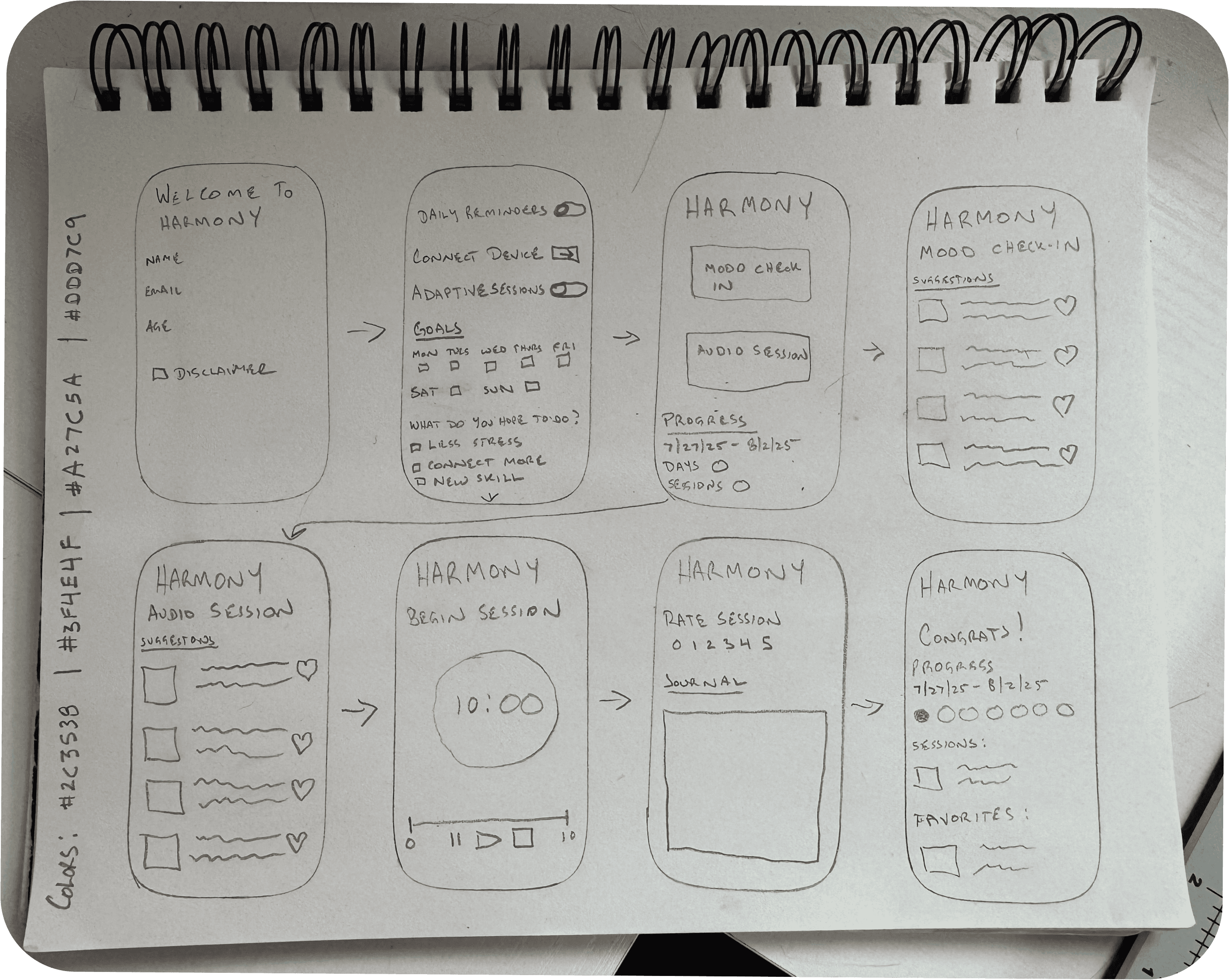
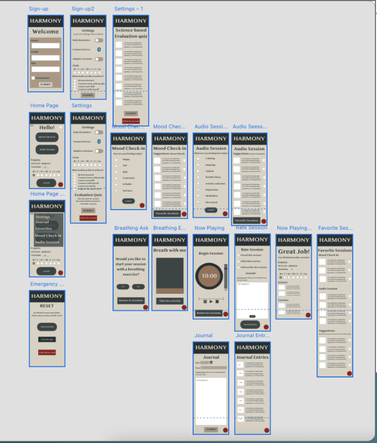
I wore many hats on this project, including initial research, looking at what was already out there and running comparative testing against Brain.fm, Endel, and Headspace so we'd know where Harmony actually needed to be different. From there I moved into the UX design work, taking things from rough lo-fi wireframes through to the hi-fi prototype in Adobe XD. I also conducted usability testing, running interview-format sessions. I timed people through tasks and asked questions along the way. Our goal was to compare process times (setup time, success rates), and have the interviewee think aloud during the tasks. This was where most of the useful stuff came out, like where people got confused or what actually felt calming to them.
Evaluation
Future Improvements Include:
AI-generated audio that adapts in real time instead of pulling from static playlists
customizable color themes for people with sensory sensitivities
haptic feedback for accessibility
advanced habit-tracking with better long-term progress visualization
collaboration with psychologists, HCI researchers, and sound designers to validate emotional regulation effectiveness
testing with a much bigger and more varied group of people.
Results:
Harmony beat Headspace on setup time by a wide margin, 48 seconds versus 142. People did better navigating and journaling, as well. Cognitive load stayed low across the board, which was a high priority for the design. The mood check-in didn't show any real difference between the two apps. We found that more than half of the participants could not find the emergency reset button, which we noted as an opportunity, given how central that feature was to the whole trauma-informed premise. People did say the interface felt clear and the colors calming.`
Setup time: Harmony significantly faster (M = 48.25s) vs. Headspace (M = 142.50s), p = .017
Navigation and journaling: higher success rates for Harmony, χ²(1, N = 4) = 4.00, p = .046
Mood check-in: no significant difference between the two apps
Participants struggled to locate the emergency reset button
NASA-TLX score: M = 2.00, indicating low cognitive workload
Qualitative feedback: praised clear interface and calming colors; noted confusion with the mood check-in process
Method:
Harmony is a semi-functional prototype in Adobe XD. The design was based on the requirements mapped out in the early stages of research, and leaning on frameworks like Shneiderman's Eight Golden Rules and Norman's Seven Stages of Action to keep the design grounded and intuitive. The core features - mood check-in, emergency reset, safe mode, journaling, progress tracking - were all built around the idea that someone using this app might already be at their limit, so the interface couldn't ask more of them than they had to give. To see if that actually held up, we ran usability tests against Headspace, having participants work through five tasks (setup, mood check-in, finding the emergency reset, navigating, checking progress) while we timed them and asked questions along the way, and used NASA-TLX afterward to get a read on cognitive load.
User Journey / Flowchart
Process Visuals
(Click the image to expand)
Hi-Fi Wireframes

Version 1
Version 2
Lo-Fi Wireframes


